

Screening international employees: Do you know what’s required?
With the UK being subject to its own privacy regulations like GDPR, are businesses aware of the screening procedures required.

Changes to DBS Checks for Fire and Rescue Services
More stringent DBS Checks (also known as Criminal Record Checks) will now be available for staff in the Fire and Rescue.

Navigating Change: New Approaches to Risk Management Will Drive Progress in Performance and Reputation
A volatile and frenetic external environment is driving seismic changes in the way that business leaders approach ongoing organisational priorities..

Social Media Screening: Is It Here to Stay?
With privacy laws constantly changing, will social media screening continue, or will it become ever more legally problematic for employers.

Background Screening in the Maritime Industry: Has ‘Below Deck’ Exposed a Gap?
Yachting can be seen as a glamorous industry to work in, with workers able to travel and work across the.
A Shape-Shifting World of Work
Tom Hadley’s take on a shape-shifting world of work To paraphrase and slightly misquote the Beatles: You say you want.

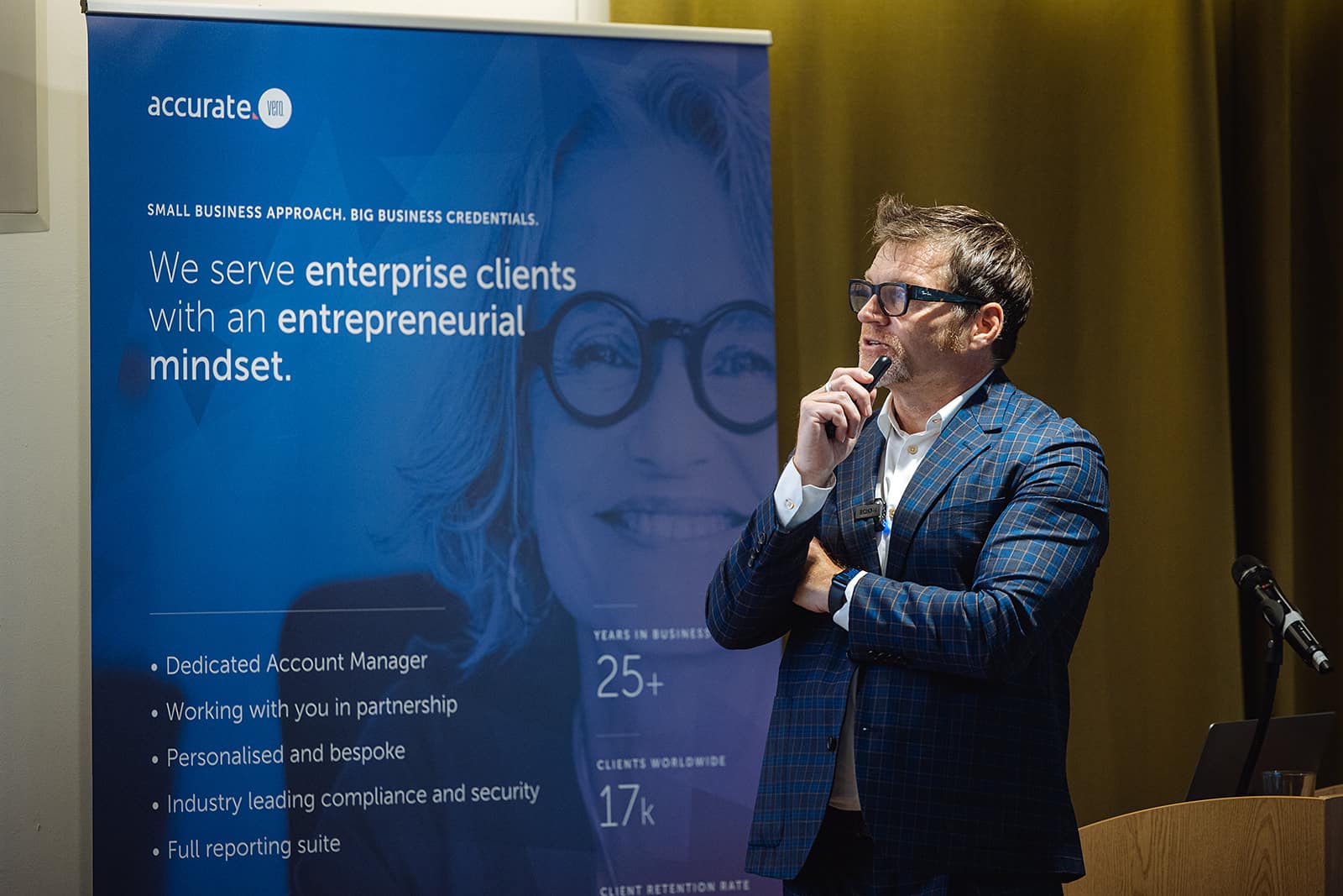
Navigating the Changing World of Work
Navigating the Changing World of Work – Five Forces of Fundamental Change Tom Hadley’s take on Accurate Background’s event in London. Discussions around.

Why should screening be part of your recruitment and employment process?
Pre-employment screening is an integral part of the recruitment process and HR function. It gives you confidence in your new.

What Candidates Need to Know About Financial Background Checks.
If you’re currently undergoing pre-employment screening, you can be sure that your future employer wouldn’t be taking you through this.

Keep Up To Date!
Stay connected and up to date by subscribing to our newsletter. Get access to industry insights, our latest blogs, events and more.